From Jupyter Notebook to Production: Building a Full-Stack SEM Image Quality Tool
How a metrology engineer crossed the gap between domain expertise and software engineering
A SEM (Scanning Electron Microscope) can resolve features as small as ~2 nm. While a standard scanning electron microscope is used for general observation, a CD-SEM is optimized specifically for industrial automation and non-destructive measurement — the workhorse of dimensional metrology in semiconductor manufacturing.
Image quality (IQ) analysis provides a non-invasive way to verify that a tool is performing within its nanometer-scale tolerances before it begins processing high-value production wafers. Think of it as a health check for the instrument itself — quantifying IQ tells you about detector efficiency, electron column stability, and the overall physical state of the tool without touching a single production wafer.
There is a second, equally important role IQ plays in the fab: fleet matching. In a high-volume manufacturing environment, multiple CD-SEM tools measure the same features across thousands of wafers. If Tool A and Tool B report different critical dimensions for the same structure, process engineers don't know whether they're seeing a real process shift or a tool artifact. IQ-based fleet matching is a more systematic and diagnostic approach than ad hoc adjustments or simply comparing CD results after the fact — it catches the root cause rather than the symptom.
Despite its importance, IQ analysis in practice often lives in Jupyter notebooks — powerful for exploration, but inaccessible to anyone outside the immediate team and impossible to run consistently at scale.
"This is the story of how a Jupyter notebook became a FastAPI backend, a Streamlit frontend, and a Docker-containerized service deployed to the public web."
The Metrics — Why One Is Never Enough
The most commonly used full-reference metric is PSNR (Peak Signal-to-Noise Ratio), which compares the maximum signal power of an image against its background noise. It is straightforward to compute but has a well-known limitation — its results often don't align with how humans actually perceive image quality. A slightly blurred image and a noisy but sharp image can produce similar PSNR scores despite looking very different to a trained eye.
This is where SSIM (Structural Similarity Index) adds critical value. Rather than comparing raw pixel values, SSIM models human visual perception by evaluating three local properties simultaneously: luminance (average brightness), contrast (variation in intensity), and structure (the underlying spatial patterns after removing brightness and contrast effects). Two images can have identical brightness and contrast but completely different structural content — SSIM catches that. Together, PSNR and SSIM give a more complete picture of image fidelity than either alone.
For focus quality specifically, Normvar (Normalized Variance) is a fast and reliable metric. A well-focused image contains more high-contrast edges and fine textures, producing a wider spread of pixel intensities than a blurry image. Normvar quantifies that spread, normalized by mean intensity so that brighter images don't score artificially higher. It aligns well with human perception of focus and blur — but it has a blind spot.
Consider a subtly stigmated image. Stigmation is an anisotropic blur caused by asymmetry in the electron beam's focusing lens — the image appears sharp in one direction but slightly smeared in the perpendicular direction. To the naked eye, and often to Normvar, this looks like a clean image. But the FFT magnitude spectrum tells a different story immediately — the energy distribution becomes elongated and asymmetric, a clear signature of directional blur. The Laplacian ratio, which ignores flat regions and focuses exclusively on edges and fine detail, also catches this degradation where Normvar misses it.
This is not a failure of any individual metric. It reflects a fundamental reality of SEM image quality: different failure modes corrupt images differently. A degrading detector affects contrast and noise statistics. A dirty aperture causes diffuse blurring that Normvar detects well. An unstable gun column produces stigmation that FFT detects best. No single metric covers all failure modes — which is exactly why this tool computes all of them together.
One metric deliberately included but prominently caveated is BRISQUE (Blind/Referenceless Image Spatial Quality Evaluator). BRISQUE was trained on natural scene statistics — the statistical properties that characterize photographs of the physical world. SEM images violate nearly every assumption BRISQUE makes: they are grayscale, high-contrast, geometrically simple, and corrupted by electron physics rather than JPEG compression or camera noise. In testing, BRISQUE scores for SEM images show little correlation with actual image quality. It is included in the tool for completeness and for users working with natural images, but its limitations for SEM are clearly documented.
From Notebook to Production
While working as a metrology process engineer, I developed scripts to analyze SEM image quality and make data-driven decisions about tool health. They worked well — for me. Running them meant opening a Jupyter Notebook, setting up the environment, and executing cells in the right order. For colleagues without a Python background, that barrier was effectively insurmountable. The motivation for building an app was simple: make the analysis accessible to anyone, without requiring knowledge of Python, the underlying image processing techniques, or the physics of electron beam formation.
The search for a robust backend platform led me to FastAPI. Three things made it the right choice. First, performance — FastAPI is built on asynchronous Python, meaning it can handle multiple image analysis requests concurrently rather than queuing them one at a time. Second, automatic documentation — Swagger UI is generated from the code itself, which meant I could test every endpoint interactively without writing a single line of test client code. Third, Pydantic integration — type hints on every request and response mean that if my code sends or receives data types that don't match the schema, FastAPI raises an exception immediately. That constraint saved hours of debugging and served as living documentation of what each endpoint expects and returns.
The containerization decision came naturally once I understood the "it works on my machine" problem. Docker packages the entire runtime — Python version, dependencies, system libraries, OpenCV models — into a portable image that runs identically on my laptop, on a colleague's machine, and on a cloud server. For a tool that depends on specific OpenCV contrib modules and a particular set of scientific Python libraries, that consistency isn't a convenience, it's a requirement.
The two-repository architecture — one for the backend, one for the frontend — came from thinking about the Jupyter Notebook workflow itself. In a notebook, computation and display are interleaved: you run a cell, you see the result. In a production app those two concerns need to be separated. The backend repository handles everything the notebook's computation cells did: loading images, converting to grayscale, running the analysis functions, returning structured results. The frontend repository handles everything the output cells did: displaying results, rendering plots, giving the user controls. That separation also meant I could deploy them independently — the backend on Render using its production Docker configuration, the frontend on Streamlit Community Cloud which runs Python 3.14.3 natively — no Docker configuration required on that side."
One architectural decision worth explaining is the two-endpoint
design. The full analysis pipeline has two distinct characteristics: the
core metrics (SSIM, PSNR, Normvar, Laplacian, CNR, histogram comparison)
return lightweight scalar values almost instantly, while the FFT
analysis returns large two-dimensional magnitude arrays for
visualization. Combining them into a single endpoint would mean every
request carries the FFT payload even if the user never looks at the FFT
tab — wasted bandwidth on every call. Splitting them into
/api/v1/analyze and /api/v1/fft keeps the primary response fast and
lean, while the FFT data loads independently. The three-tab UI in the
frontend mirrors this split directly.
Lessons From Building It
Having domain knowledge and being able to write Python can only take you so far when the goal is delivering a tool for the masses. I knew how to analyze SEM images. I could read documentation for FastAPI, Docker, and Streamlit independently. What I underestimated was the gap between understanding each piece in isolation and wiring them together into a coherent, deployable system. That wiring — and the debugging it required — was the real education.
Some bugs were humbling in their simplicity. The BRISQUE
functionality requires an OpenCV model file to run. In the notebook, the
path was configured relative to wherever the script was executed from.
When the same code ran inside a Docker container, the working directory
was different and the model file couldn't be found. The fix was a single
line — Path(__file__).parent / "opencv_models" — an absolute path
anchored to the location of the Python file itself rather than wherever
the process happened to start. One line. Hours to find.
A subtler bug appeared only after deploying to production: a
ValueError caused by a nan value being passed to the JSON serializer.
Python's json module simply cannot serialize nan — it's not valid JSON.
The root cause was a division by zero in one of the metric functions
when processing a particular image. The fix required a recursive
sanitizer that walks the entire response dictionary and replaces any
non-finite float with None before serialization. What looked like a
serialization bug was actually a signal about an unhandled edge case
deep in the analysis pipeline.
Docker networking produced its own confusion. I assumed that because
both containers were running on my machine, localhost would connect
them. It doesn't — each container has its own isolated network stack,
its own localhost. Docker Compose creates a private bridge network and
assigns each service a hostname matching its service name. The frontend
reaches the backend not at localhost:8000 but at http://backend:8000.
Understanding that mental model — containers as isolated machines on a
shared private network — unlocked the whole deployment architecture.
The second major learning was about AI-assisted development. I used Claude as a coding collaborator throughout this project and I want to be transparent about that, because the conversation around AI tools in engineering is often framed badly — either "AI wrote everything" or "I never use AI." Neither reflects how I actually worked.
The domain expertise, the architectural decisions, the metric selection, the debugging intuition — those came from me. What Claude provided was acceleration: helping scaffold boilerplate, explaining unfamiliar patterns, and catching bugs I had stared at too long to see. The analogy I keep coming back to is my Casio FX scientific calculator. Growing up studying physics, I memorized constants, worked through quadratic equations by hand, looked up tables. When I got the Casio FX, things changed dramatically — I could compute roots faster, plug in constants without tables, write expressions for repeated calculations. But the calculator didn't solve physics problems. I still had to understand the problem, choose the right approach, and interpret the result. The calculator removed arithmetic friction so I could focus on the physics.
Claude did the same thing for software engineering. It removed the syntax friction — the boilerplate, the API lookups, the scaffolding — so I could focus on the architecture, the science, and the decisions that actually matter. If anything, working this way deepened my understanding, because I had to direct, validate, and question every piece of generated code. You can't do that without understanding what you're building.
The Result — and What's Next
The live app is at https://sem-iqm-tool.streamlit.app.
The interface is organized around how a metrology engineer would naturally approach an analysis. The first thing you want to see is the images themselves and the key numbers — so the Metrics tab leads with side-by-side thumbnails of the reference and test images, followed by SSIM, PSNR, NV ratio, Laplacian ratio, and CNR as metric cards, and a horizontal bar chart showing their relative scores at a glance.
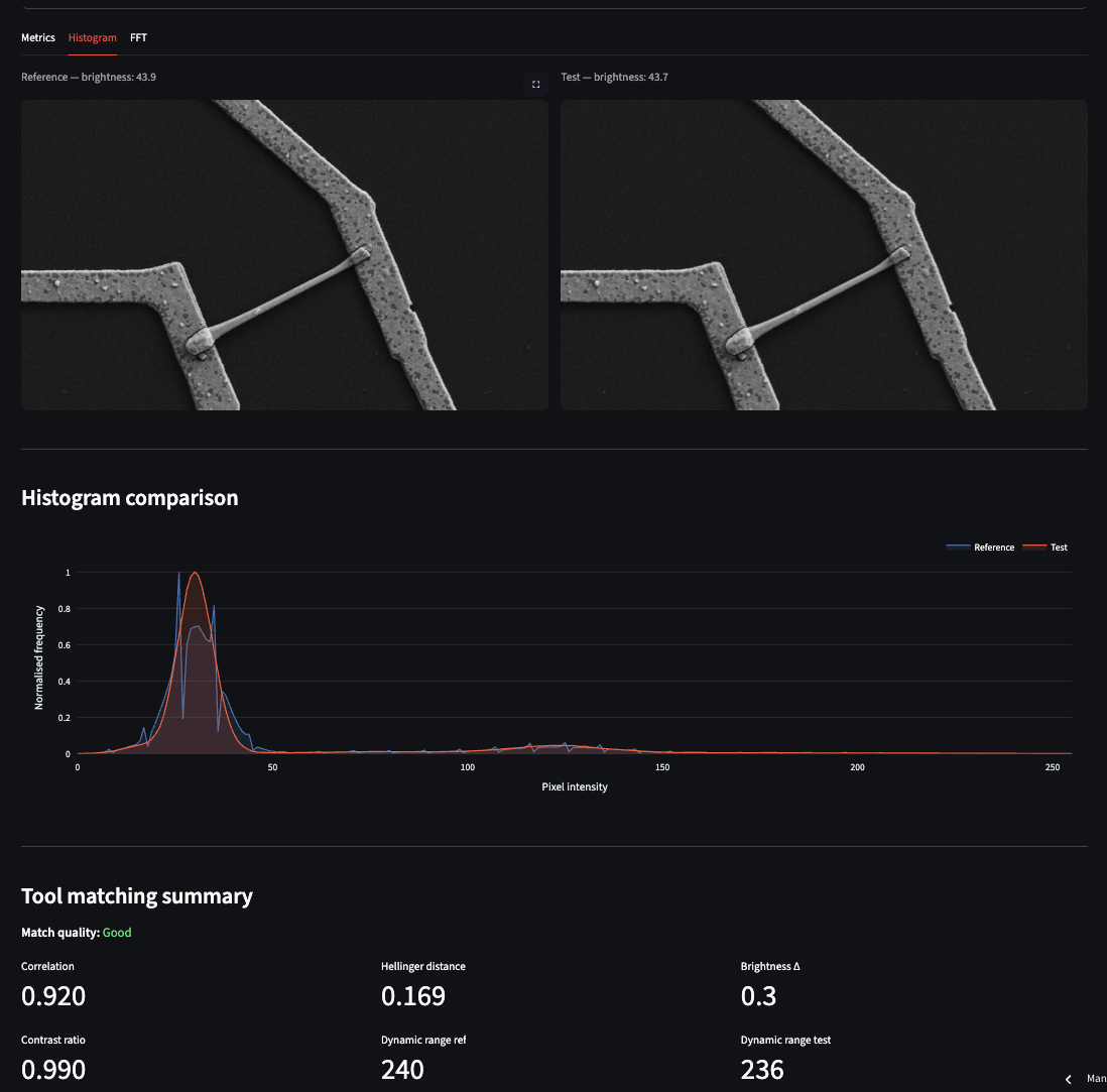
The screenshots below illustrate a real test case: a reference image compared against a version with subtle artificial stigmation applied using a rotation kernel (ksize_x=2, ksize_y=1, angle=0.2). The difference between the two images is essentially invisible to the naked eye.
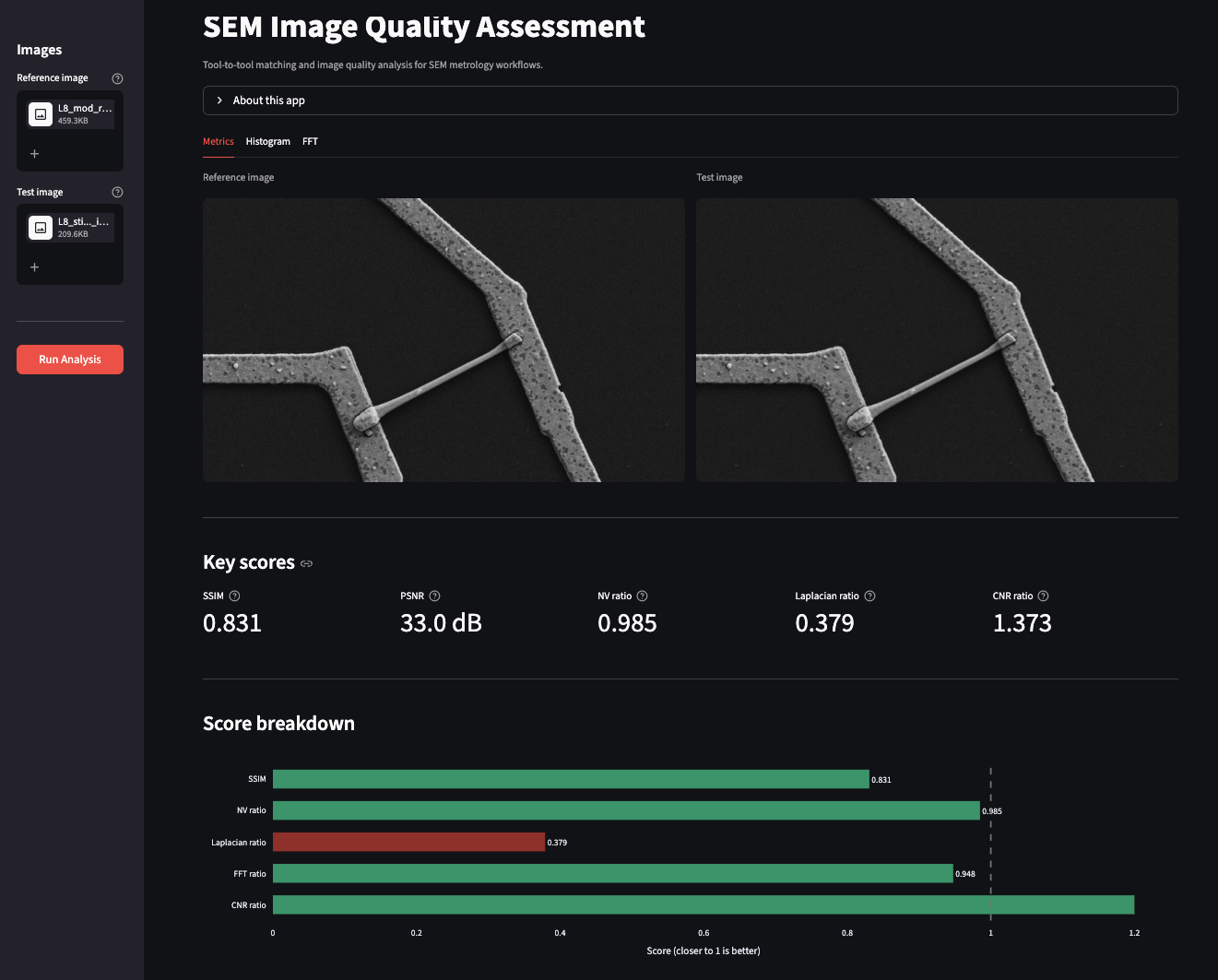
Most metrics rate the test image as acceptable. The Laplacian ratio, however, flags it as poor — exactly the sensitivity to subtle anisotropic blur that we discussed in the metrics section. The download button at the bottom of the tab exports a timestamped CSV report of the full analysis. The Histogram tab shows overlapping pixel intensity distributions for both images alongside a tool-matching summary. In this test case the Hellinger distance between reference and test is 0.169 — close enough that histogram matching alone would not have flagged the stigmation.
The FFT tab is where the degradation becomes unambiguous. The sharpness ratio of the test image is approximately 0.95, and the difference spectrum shows a brighter central region — a direct indicator that the test image has shifted toward lower spatial frequencies, meaning it is slightly more blurred than the reference.
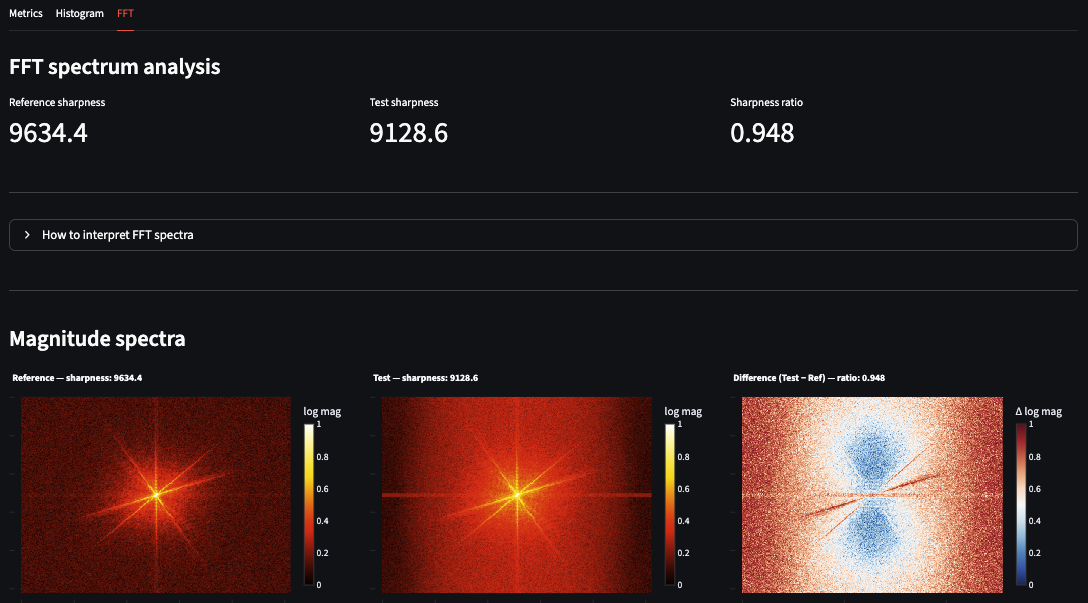
This three-metric combination — Laplacian catches it, histogram misses it, FFT confirms it — is a practical demonstration of why no single metric is sufficient for SEM image quality assessment.
Current limitations and next steps
Both the backend (Render) and frontend (Streamlit Community Cloud) run on free tiers. First-time visitors after a period of inactivity may experience a 30–60 second wake-up delay — a characteristic of free tier hosting rather than a performance issue with the application itself.
The current version analyzes one image pair per session. The next version would add batch processing for analyzing multiple pairs in a single run, session history for tracking tool health over time, and asyncio.to_thread to offload CPU-bound computation from the async event loop — making the backend properly scalable under concurrent load.
The most useful thing I built in this project isn't the app — it's the understanding of how domain expertise and software engineering reinforce each other. A metrology engineer who can deploy a production service thinks differently about what tools are possible. A software engineer who understands electron optics thinks differently about what the data actually means. The gap between those two perspectives is where genuinely useful tools get built.
If you work in semiconductor metrology, electron microscopy, or any field where image quality matters — try the app with your own images. It works on any grayscale or RGB image pair, not just SEM. I'd be glad to hear what you find.
The frontend code is open source on GitHub. The backend and core analysis package remain private, but the architecture, the metric selection rationale, and the deployment approach are all documented here and in the repository README.
Imran Khan — khanimran.com · LinkedIn
Demo images adapted from: Aversa et al. (2017). Scientific Reports. https://doi.org/10.1038/s41598-017-13565-z